This Week in Twitter

  • How it feels to make money with Open Source: http://t.co/goxZ5L66 #
  • Airbnb to Couchsurfing is what App Store to Open Source. #
  • wondering who will be the first to write a Smart TV virus. A DDOS performed from milliards of TV sets is interesting. #
  • underscore.js, jQuery and backbone.js are slowly making Smalltalk out of JavaScript :) Next step is abandoning the C-like syntax? #
  • Software development is a field, where even being very generous to colleagues you have no choice but to insult them. http://t.co/jflIDdPM #
  • Have you ever asked yourself why Jesus choose to ascend? Not to remain here and teach and support and help us? #

Powered by Twitter Tools

Visual Studio 11 RC UI

Visual Studio is an undisputed king of IDEs in the Microsoft ecosystem. There is virtually nothing even remotely comparable with it on the market. It is so good (for a mainstream product) that it is even used outside of the Microsoft ecosystem, for example in cross-platform game programming, or in embedded development. With already cool and even more improving support of JavaScript and HTML5, it has chances to expand on to the enemy’s territory and begin to be used by (historically very LAMP-biased) masses of web developers. Some existing users of Visual Studio would remain in the Microsoft ecosystem just because they can use Visual Studio (I’ve been using Eclipse in the last 9 months, I know what I’m talking about). Thus, Visual Studio is one of the most critical products for Microsoft’s future. And this product absolutely deserves and needs the best UI that Microsoft’s smart and passionate guys can ever make.

Now, what is the Metro design language? If I had to describe it in one word, it is semantic zoom. The oversized captions abruptly cut on the right side make you believe you’ve zoomed in into a virtual surface larger than your screen. This is ingenious for smartphones with their small screen size. Just by taking a brief look, users immediately know that a) there is more info than currently shown b) the additional info is on the right, so it is natural how to navigate and c) they might think ”my smartphone display is a small window into a virtual surface, much like a magnifying glass or a porthole, hey, cool, let’s explore!” I believe, everything else is just thinking this initial idea consequently through. For example, unlike iOS aestethics with their hyper-physical elements, expensive materials texture, stitching and virtual LEDs, the aesthetics of Metro is demonstratively symbolic and abstract. Maybe it is because if you would really start zooming into “physical” controls, what you will see is only ugly manufacturing details, not a new level of gorgeous controls. The emphasis on typography is apparently also consequence of the zooming metaphor: in Metro, we’re zooming close enough so that even non-typographers start recognizing font differences and typographical issues. Besides, in a symbolic and abstract zoomable world devoid of expensive-looking textures and stitching, users need something they can adore, and it can be only elegant graphics of icons and types, and pure vibrant colors.

So, how would you apply Metro to Visual Studio? You can take the “consequences” - large captions, vibrant colors and elegant two-dimensional icons – and mechanically apply them to the existing UI metaphor. It seems that this is what the UI team really did. Or, you can descend to the very root concept, to the semantic zoom. Software development is a activity of processing tremendous amounts of information. Non-programmers normally have no idea what a huge amount of information is being processed during development. This is the reason why programmers hate scrolling. They also hate employers who give them only one monitor, because they need two, or, better, four. It is not because four monitors would give them enough space to open the full source code of the software they’re working on. No program bar very trivial ones can be fully shown on just four monitors. Typically, they would put different things on different monitors, like, the solution explorer with the errors list and console output in one display, the source code into the other, and a help page or API reference into the third one, and a browser or simulator running the software they are writing into the fourth one. Even though they have four monitors, each can still display only a tiny bit of information they need. Now remember the porthole. Isn’t this a case ideally suitable for Metro – display size that is too small compared to amount of information that has to be shown?

So, if the Visual Studio team would be really radical, they should have had scrapped away the good-old MDI interface, and add semantic zoom inside of the each type of window Visual Studio has. Semantic zoom in the source code editor: captions represent class methods (with one additional caption to “show all”), the body represents the source code of the method. Semantic zoom in the solution explorer: captions are projects, body is the list of files. Move a file from project to project just like you move Win8 app from one group into another. Move a method from child to base class by dragging and dropping. Such things. Radical things. Revolutionary things. (Well, Smalltalk IDEs have already had most of this 30 years ago, but we’re speaking about the mainstream here.)

I don’t know why this hasn’t happened, and why the Visual Studio team has only adopted some visual ideas, without changing the core of the UI metaphor. The result is catastrophic in terms of community feedback. They write that they have added more energetic colors, but don’t explain why an MDI interface needs them. They use ALL CAPS in the ancient menu bar, pretending them to be zoomed in, but really making them to look just weird and unprofessional. They’ve replaced the old icons with new, less physical and more symbolic ones. This is old:


And this is new:


I like very much the elegance, modernity and simplicity of the new icons, but let me tell you one thing. Software developers are absolutely allergic to any changes, which do not improve their productivity in a visible and palpable way. They, too, might appreciate the new elegance. But they are paid for getting things done, and are struggling at the forefront, drowning in the massive amounts of information they have to handle. Give a drowning man a hand, and he will bless you, give him a flower, and he will curse you.

In my opinion, any of these changes, and even more radical visual changes (like OMG, making colorized source code more elegant, or removing tiny meaningless icons in front of file names in the solution explorer) would be eagerly accepted or at least tolerated by the community, if the UI metaphor was changed to be a more productive and more ergonomic one. But now, the Visual Studio UI team has to handle angry and vocal users of this very critical product, threatening to stay on the previous version, or even to start looking around and trying other IDEs.

I personally have no own practical opinion. Just by looking at the screenshots it seems to be more elegant, and it wouldn’t take more than a week to re-train all the source code processing reflexes. It is only a bad after-taste of a missed chance. Any bigger change will make users angry. You cannot make users angry two versions in a row. That means, Visual Studio 12 cannot be a radical change. And it feels that the opportunity for change in VS 11 is wasted. This is a dangerous situation for Microsoft. Ballmer was very right with his “Developers!” tirade. The way Microsoft ecosystem developers were handled lately is a series of mis-management, and I wonder, why this issue has not yet been escalated to the very top. I believe, this issue is important enough to be in the top 3 list for Ballmer.

Facebook mobile app

The Facebook mobile app has average of 2 stars in the App Store with 23k ratings, and 3.6 stars in Play Store, including 631k of one-star ratings and 226k of 2-star ratings.

There is an interesting break down here. I also don’t like the current Facebook mobile app.

The usual discussion happening over and over again today is “we have our web site / our mobile web site, so why do we need a mobile app”? I feel that way too often the answer is “we don’t need it, but the competition does have an app, so we just have to have a “check” against this feature too”. I suppose, the very first competitor who decided to make an app was either just experimenting in this venture area hoping for some unexpected insights. Or their technical director was just an Apple fanboy. Or they were influenced by some technical mass media. Anyways, it happens way to often that a company cannot provide you with a compelling business reason of having a mobile app, when asked.

In Facebook’s case, it hard to believe that. They might have issues with monetizing the mobile app, but it is just hard to believe they would release an app without a compelling reason. And this is bad for Facebook, because this means their initial business ideas didn’t fully worked out – a lot of people expect something different than this app does.

Speaking about my person, there are three two reasons why I have this app installed. The first reason is that it was pre-installed on my HTC device. The first my reason to have this app is because I want to be able easily launch Facebook after unlocking the screen. The app is an icon on my Android home screen, it has a very specific position on the screen which I’ve learned by heart, so I can launch it instinctively even without looking at the screen. When I’m using the browser, I have to start the browser first, then open up its favorites list, then scroll this one-directional list to find Facebook, then launch it. Yes, I know that in WP7 and W8 it is possible to put a web site link into the start screen, which would make the same for me. But I’m using Android and I’m way to lazy to find ouf how to do it. I suppose it is already possible, but I haven’t stumbled upon this feature yet.

The second reason is, when I open the Facebook app, I want to immediately see the new messages, i.e. the messages appeared since I’ve last used this app. Basically, the same principle as in the Mail app. Loading messages is very slow, we cannot speed it up (until LTE will establish itself in Germany), so let’s use the idle time to load them in background. So, and this is not like the Facebook app works now. When I start it, it first turns on the GPS receiver and prints a “Loading” message. I don’t know why does it need GPS, I don’t remember I ever allowed it to use my location; I don’t even remember I’ve ever used it to post a message. And, it takes 8 seconds from the start till my Facebook news stream appears. And this is using WiFi connection to my 25MBit/s DSL router! In IE9 on my PC, the same task takes 2 seconds, in the Chrome on the same HTC device it takes 4 seconds. For me, this rules out the very reason of using this app.


PS. After writing this post I’ve opened the bookmarks section of standard Android Chrome browser and have found the feature to create bookmarks on the home screen. I’ve removed the Facebook app and replaced it with a web page shortcut.

0X0F

/*
 * @author: Maxim Fridental
 * @version: 1.0
 * @description: Yet another nostalgic post. Handcrafted in HTML.
 *
 * TODO: stop whining.
 */

Today I’m facing the last 0x0f days of my life as software developer.

# I have very strong and mixed feelings about that, because being
# software developer is part of my identity.

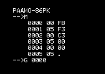
# In 1987, for the very first time I’ve typed and run a program.

# I’m not author of it. It was printed in a magazine, and I’ve just entered
# it. After turning on, the computer was typically finishing booting in under
# 0.5 seconds, and then the prompt appeared, and the user could enter commands.
# The M command allowed to change memory locations, and the G command started
# execution from the specified address. Here is an assembler listing:

    .org 0

    ei        # Enable interrupts
    di        # Disable interrupts
    jmp 0

# The “interrupts enabled” pin of the CPU wasn’t used for interrupts in my computer,
# but was attached to a speaker instead. The speaker had a low-pass filter before
# it, so that even though the CPU ran at around 1.8 MHz you could hear an audible
# tone. I still remember how happy I was hearing it! I’m not that much happy
# today even when I buy my next gadget.

# The very first programs I’ve written myself were based on that code. I was
# adding various amounts of NOPs, EIs and DIs, experimenting with different tones
# I could produce using the speaker, until somebody would come over to me and
# said in an artificially calm voice: could you please shut your thing up? And
# then, everybody was enjoying the silence.

# Maybe for a couple of minutes or so.

# Because I would then use my tape recorder to load a game and start playing.
# We had text-mode games that have compensated their lack of
# fidelity and performance with razor-sharp balance. If you are
# interested, here is a JavaScript emulator.

http://radio86.googlecode.com/hg/online/radio86.html

# You want to select the game called “KLAD” (note the dropdown list is not
# alphabetically sorted).

# In fact, I’m very lucky that my first games were text-mode based. The further
# game development went along the way of improving fidelity and adding multimedia,
# without any significant improvements in the balance (also known as the Flow), so
# that I wasn’t interested in them and avoided the fate of becoming a serial gamer
# spending all his free time on boss raids in some virtual world.

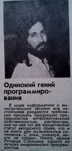
# I was captivated by the software development though. About this time, one of
# the USSR scientific magazines has published the following article named
# “A lone programming genius”:

# One of the strongest american software developers Richard Stallman,
# said the article, is against copyright on software. I was so fascinated
# I’ve cut out the article and pinned it on a wall above my table. I
# too wanted to become an ingenious programmer and to have an article
# about me published in a popular scientific magazine. I didn’t know that
# I had more chances to achieve the “being lone” part though.

# My conversion into software developer finished in 1993, when I’ve
# read the article “How to make an own game” in the russian edition
# of PC World magazine. Not only it has been written by Andrei
# Rodionov, a guru of software development (20+ years of experience
# at that time) and has provided a lot of concepts, patterns and
# practical gems on software development in general. But it also
# had such a lovely extreme spectrum of its topics, spanning from
# the details of the C syntax for pointer dereferencing to the
# philosophical summits of comparing programming with creating
# an own little universe, and going through the Ten Commandments
# applying them to the virtual objects living in the software runtime.
# And have I already said this article had amazing illustrations?

# Now, 25 years later, I can say that being software developer
# has profoundly influenced all my life in very many ways.

# I love my work. I have fun when working.
# I live more life, because I have 8 hours more fun per day.
# I earn above average.
# I have freedom of move, as this job is everywhere the same.
# I work in the society focus field (IT has replaced the
# astronautics of 60-ies), which is
#   more rewarding
#   less bureaucratic
#   has more possibilities for self-realization
#   has more possibilities to change the world
# I have also obtained a number of specific abilities:
#   rapidly understanding things by making a mental map
#   subdividing a large complex task into smaller palatable ones
#   subconscious time and space optimization of everything
#   powerful signal-to-noise filtering during communication
#   rapid information retrieval

# Therefore I’m very grateful to God, to my parents and to my
# friends, teachers and colleagues who allowed me to live
# these very fulfilling 25 years in the way I’ve lived them.

/*************************************
 * So long, source code! I love you! *
 *************************************/

This Week in Twitter

Powered by Twitter Tools

UX of Airport Security Check

What UX disciplines are involved in design of security checks?

Interaction design: Developing clear and easy understandable sentences to be used in communication between security staff and passengers. Developing gestures for passengers not speaking any of the supported languages.

Ergonomics: Ensuring that the metal detector gate width and the transport belt height are suitable for most passengers. Developing a hand-held scanner that can be comfortably operated.

Theory of mass service: Calculating the total number of pipes, designing the barriers before them to parallelize incoming stream of passengers, designing the exit of security check area.

UI design: Designing staff clothes to be formal to provide feeling of authority (uniform-like look), but on the other hand not threatening to avoid negative feelings (no weapons, short sleeve shirts, biz-casual necktie). Adding elements of pilot uniform to mix-in some general flight excitement. Define fonts for signs to express both authority and hyper-modern look of the airports. Define the entrance and exit walls of the security check area to be made transparent to avoid negative feelings and suggest transparency and usualness of the procedure. Define the requirement that the staff on duty must be good-tempered, polite, and smiling.

Information Architecture: Ensuring that new or rarely flying passengers realize as soon as possible the airport processing workflow (Checkin -> Baggage drop -> Security check -> Gate -> Boarding), at least some time before they arrive to the next station so that they have time to prepare themselves to the procedure.

UX Implementation: ensuring the staff follows the defined UI design, ensuring that the security check zone corresponds to the UX design (no broken parts, clean, well lit and well conditioned). Regularly monitor the compliance.

Product Management: define performance metrics for security checks (perhaps number of passengers serviced per day per staff member), monitor the metrics, identify and eliminate issues.

What else could be involved?

Gamification: For example, print a slip with the security check duration. Passengers can then compete with the others on the same flight, or with the other passengers in the same airport. Slips with especially short security check times could be printed on a golden paper, and passengers could use them as collectibles. Providing some cash or merchandise bonuses for some number of collected points can be considered.

Creating a flow: develop several alternative workflows of the security check (this is anyways recommended by some FBI experts to increase the effectiveness of the check). Different workflows must have different duration, and at least some of them must be triggered by the passenger, eg. by the kind of an answer he gives on some question. Those passengers who are totally in the game must be able to figure out the current game rules and behave correspondingly to shorten the security check. The game rules must change in regular intervals.

Integration with social networks: when ordering the flight ticket, passengers may (but not required to) provide proof of owning an account on one of the social networks (of those kind that require real provable names to be used). Using this information, his security score can be calculated using some undisclosed formula (for example, including whether he has entered his hometown and job in the profile, and how many friends he has, etc). If his score is greater than some threshold, the time stated on his slip (not the actual time of security check) will be reduced by some known fixed amount.

Product management: Invent a method to earn money on this process. For example, build a store with an entrance in the unsecured zone and exit in the secured zone and sell Air Traveller Suits specially designed to be used during the flight:

  • 1/2 size larger than labeled, because human body tend to increase its volume on lower pressures
  • Fabrics fine-tuned for the standard humidity and temperature of the cabin, comfortable for skin, comfortable for long sitting, designed for sleeping…
  • …but still cool and trendy looking, perhaps in the style of the airline, and with the airline logo
  • With integrated headphones and integrated personalized RFID chip that can be automatically used everywhere instead of boarding cards, as well as for passenger navigation in the airport and during the boarding to show him his seat.

The suit can be pre-ordered in the Internet. Because passengers would change their clothes in the shop, their security check procedure could be simplified to going once through the metal detector.

TV set usability model

A heated discussion today at work has helped me to understand how to think about TV set usability. But before we get to the details, let’s first talk about the cars and computers.

The UX model of cars can be best described by “There is a button (lever, pedal, wheel) for that”. Whichever interaction you want to perform with the car, you would need to remember or find the corresponding button, lever, knob or pedal, and activate it. One button – one function. There are a number of other consumer devices that follow this model: water-, rice- and egg-boilers, coffee makers, oven, microwaves, dish and clothes washes, vacuum cleaners, bikes, bicycles, lifts, clocks,… This UX model works fine, as long as the number of functions supported by the device is relatively small.

Computers have a completely different UX model. You typically have some kind of avatar representing you in some kind of a virtual world. This avatar can be a mouse or Kinect pointer, selected (focused) menu item, text cursor, command line prompt, or just a virtual mirror of your fingertip. To operate the computer, it is neither necessary nor possible to find a button or lever correponding to each function. Instead, you have to observe the screen, understand how the displayed elements build a virtual world (and what kind of the world), and find out, how can you change this virtual world using your avatar(s) to achieve your goal. It might well be the case that this UX model is harder to learn and harder to use than the car UX model. But the computer UX model has a damn good reason for its existance: you see, computers can perform unlimited number of functions.  If we operated computers like cars, we’d need an unlimited number of buttons.

The TV sets are inbetween.

On the one hand, you have the buttons Power, V+, V-, P+, P-, Play, Rewind, etc, which directly correspond to exactly one specific function. On the other hand, you have a D-Pad that can be used to move the selected item in the virtual world of the on-screen display. And on the third hand, you have the color buttons, which are kind of some pre-historic extinct animals, an evolution stage between creatures living in water and creatures living on the earth. At any given time, each of them corresponds to a direct function, but their functional bindings change with the time, forcing users to think in modes.

Forcing users to think in modes is, for some reason, an extremely popular sport among many CE manufacturers, and two branches share the infamous first place: TV sets and electronic clocks. When your TV has booted, you are in the LIVE_TV_MODE, and your buttons do one thing. But if you press one of them, you are in LIVE_TV_WITH_PROGRAM_TITLE_SHOWN_MODE, and some of your buttons will do another thing. And if the channel you’re watching has a corresponding Hbb-TV offering, you will eventually be switched into LIVE_TV_WITH_RED_BUTTON_SHOWN_MODE, which is almost the same but the functionality of your red button is different. From that mode, you can optionally go to the HBB_TV_WITH_LIVE_TV_MODE, where some of your buttons will retain the functions of LIVE_TV_MODE, while the functions of the others will be entirely determined by the loaded web app… You’ve got the big picture. In reality, I could easily name at least 20 different modes of a modern TV set (and I suspect there are in reality many, many more hidden modes).

Now, imagine a remote control with a combined set of buttons, that is, the up arrow in the D-Pad is combined with P+ button, and the down arrow is combined with the P- button. In the LIVE_TV_MODE, their function is P+ or P- allowing you to switch to the next or to the previous channel. In some other modes like web apps or settings, they work as a normal D-Pad allowing you to move your selection up or down the screen.

Now. You want to display a vertical list of channels in an overlay above the live TV picture and allow the user to select and switch the channel. You have a channel number 1 and a channel number 2. Are you going to place #2 below #1 or above #1?

If you place #2 below #1, you remain in-sync with the common sense and the universal principle of writing from top to bottom in the most world cultures, as well as seeing “what comes next” imaginary below of “what was before”. In Chinese, they don’t even say next task or previous task, they say the task below and the task above. By doing this, you can also retain a sane scrolling direction, that is, when you select the last (the most bottom) channel from the list and then press the button to select the next one, your channel list will scroll upwards, and the next channel will appear from below.

There is the problem with this approach though. Remember, the down arrow on your remote control is combined with P-. So, now, if channel #2 is below channel #1, and you are staying on #1, to select the next channel you will have to press the down arrow / P- button! But, in the LIVE_TV_WITH_NO_CHANNEL_LIST_SHOWN_MODE, the P- button would switch you to the previous channel, not to the next one!

So, let’s break the rules and place the channel #2 over the channel #1 in our channel list. We stay on #1, now, to switch to #2 we must press up arrow, which is coincidentally the P+ button, exactly the same button we use in the LIVE_TV_MODE. Profit? If only life was so easy. Now, the scrolling direction is completely awkward – to see more channels, you have to start at the bottom and go up the list. What makes the things even worse is that the channel list is not the only list in the TV set UX. For example, you have a list of movies shared by your DLNA server and ready to be played. In that list, there is no reason to pay attention to P+/P- problem, so that you would develop it in a sane way – first items on the top, last items on the bottom. Now, how are you going to explain the user that there are two different kinds of the vertical list, and in the channel list he has to work his way up, while in the movie list he has to work his way down?

That’s crazy, it is like having right-side and left-side driving rules on the same road, like on this bridge connecting Hong-Kong (left-side rules) with China’s mainland (right-side rules):

Oh, and what was the reason of today’s heated discussion? Suppose you want to be user-friendly and want to provide a way to scroll a whole page in your lists, instead of slowly selecting one item after another. The right and left arrows of D-Pad should implement this page-wise scrolling.

Now, quick, answer: which horizonal arrow you have to press to display the next page in the channel list?


Great Frontend Development

tl;cr: great frontend development is not trivial, and requires a lot of power to make decisions.

There are an interesting article about how important the role of great frontend software developers is in creating great user experience. They even go so far as suggesting to move frontend developers out of the engineering department and plant them into the UX department.

I’m not sure if this advice can or should be universally applied. The reason of this move is apparently inherent priority differences between engineering and UX dept. Just like creating fixed formal software processes, this is often a hint that there might be some inter-human issue, which is better to be solved between the corresponding humans. As for me, I don’t see a reason for an engineering department to exist if they don’t put user experience over any internal technical software quality metrics. At least when we are speaking about companies producing web software. It is because the cleanness of software architecture and correctness of the source code is only important for the second and all subsequent generations, while UX is important from the very beginning on. Without an absolutely awesome UX, many startups wouldn’t even have a chance to make a second iteration.

On the other hand, frontend developers, being remote from the engineering team practices and processes, would tend to produce dirtier source code and less reasonable architecture, which would mean slower, buggier and more expensive implementation of second generation UX.

Yet another consideration is that by dividing the team in “we” and “they”, you can almost force backend developers to be if not openly hostile, then just indifferent towards UX goals and needs. This is never a good idea. All the frontend can show is the content coming from the backend, and the content (and its quality and real-time-ness) constitutes often more than 99% of a great UX.

Perhaps one would be better off by organizing the hiring practices in the company so that every single creative person would care about UX of the product. But this would create yet another set of problems – for example, how to handle the strong opinions some backend developer might have against UX decisions made by the people primarily responsible for it. And there is no simple answer to that.

What I would like to support and to elaborate in this article, is that the frontend development as an activity is very distinct from, say, backend, services or database development. You also need a very different skillset as a frontend developer. And by saying this I don’t mean that JavaScript is so much different than PHP, Java or C#. And I don’t mean you have to have a very special mind to be able to understand how to make CSS3 work for you (in every browser). Of course, these differences are indeed present, at least if you develop in HTML. But even iOS, Android or Silverlight developers, who enjoy more reasonable (as in: clean and modern) languages and tools, are very different. Let me give you an example.

The story is to program a media player (that is, an area playing video and showing some player controls as overlay above it). The first task is to program the button that would start the playback. All the visuals are already created by the designers, and by using Silverlight, they are already automatically coded, so that you don’t need to cut them from a Photoshop file and write the trivial code of placing widgets on the canvas. Basically, you can start writing the event hander of the play button. What is your first thought?

Now, an unexperienced frontend developer would think something like this: okay, so I need to fetch the documentation about the player engine we’re using, find out how to create an instance of the player, and I would expect this object will have a method play(url) or something like this, and I will call the backend service to get the url from CMS, pass it to the player, and we’ll be all done.

A great frontend developer would think: shit!.. There are so many ways to fail! What if some moron would place the player in the CMS onto the web page, but will forget to configure any movie for it? Are we going to display an error message in this case? And which one? “Thank you for helping us to fire a moron that has forgot to configure the movie for your pleasure”? Well, perhaps in this case, we shouldn’t even show the player at all, and fill its space on the page with something else. So I gotta go check this out with the web page developer, and with the UX designer, and yes, perhaps it is a good idea to go talk with the CMS guys, perhaps they can build some sort of pre-publish check or so.

But ok, even with this check, there are another ways to fail. What if the url of the media file is invalid? Something didn’t work out with uploading the movie to the server, or somebody has used characters in the url that are not allowed, or the streaming server is just down? Well, perhaps we should make a web request to the media file url as soon as possible, even before we have displayed any UI, and in case of an error, display something else? This would mean, the web page will have to be able to re-layout itself dynamically on the client side. Wow. This looks like a bigger feature request. But we don’t want to waste screen space by a big black box showing an error message “Something went terribly wrong with our streaming server”! Do we?

Still exporing the ways to fail, what will happen if we start to play, and only then will know it is not possible? The streaming server might go down a millisecond before the user pushed the play button. Or something went wrong in the media publishing so that a corrupted media file has been produced. Or our media player has some requirements on the running environment, and not every device that will run our app will be able to comply? Or the user will leave the WiFi zone and fall back to 3G? Oh my gosh, there are a lot of issues here. So, OK, I’m going to write all of them down, and then go one by one and decide how am I going to handle them…

And he will do this, and will finally realize how huge this task is, because it will include changes in the page rendering, in the backend services (because he will want backend to save the latest watched play time before the player stopped working), in the CMS publishing process, and even in the media publishing and transcoding process (because he will check how their responsive design works and how the player looks when scaled down or up, and therefore will demand additional media sources to be transcoded in various screen sizes).

This Week in Twitter

  • Friday #
  • I liked a @YouTube video http://t.co/GDYlqHOA "Common, Simple, Beautiful" Original by Jennifer Chung #
  • Just posted a photo http://t.co/2ok3XsHN #
  • is seriously considering buying PS3 just because of this game. No, because of this game soundtrack. http://t.co/Tsvh3Nuv #
  • Bootstrap and LESS seem to radically relieve pain of HTML. Next time you ask what cool software comes from Germany, don't forget LESS. #
  • ??, ??. ?????, ?????. #
  • ?,?,?,?. #

Powered by Twitter Tools